
4 Tips to Making More Accessible Emails
Emails are still a cornerstone in business communication. From promotional newsletters to crucial updates, they connect you directly with your audience. But in the rush to design eye-catching campaigns, are you inadvertently excluding a significant portion of your subscribers?
The truth is, many common email design practices create barriers for people with disabilities. Just like on your website, poor color contrast, images without alt text, and unhelpful link text are just a few culprits that can make your emails unreadable or unusable for millions.
So, let's dive into the essential accessibility considerations to remember while you’re creating your email campaigns.
#1 Color Contrast
You are likely using your brand colors to create your email communications, but if the contrast between your text and background is insufficient, it becomes a major hurdle for users with low vision or color blindness.
The Problem
Low Contrast: Light gray text on a white background, or dark blue text on a black background, can be nearly impossible to read for many.
The Fix
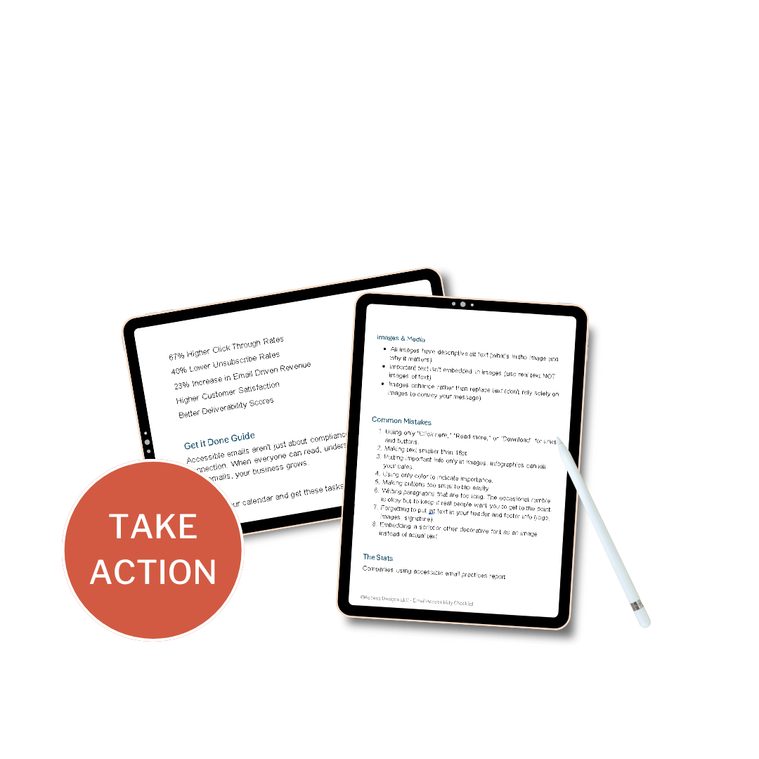
Accessibility guidelines aim for a minimum contrast ratio of 4.5:1 for normal text and 3:1 for large text (18pt or 14pt bold and larger), as recommended by the Web Content Accessibility Guidelines (WCAG).
Integrate tools like WebAIM's Contrast Checker or the Color Contrast Analyzer into your email design process.
If color indicates importance, also use bolding, underlining, or an icon to reinforce the message.
#2 Images & Alt Text
Images can enhance your email's appeal, but without proper consideration, they become invisible to screen reader users and those with images turned off.
The Problem
Images without descriptive alt attributes convey no information to screen readers. An email that relies heavily on images without alt text is effectively blank for a blind user.
Alt text that simply repeats the image caption or adjacent text is unhelpful and repetitive.
Cramming alt text with irrelevant keywords harms accessibility and can make your email look spammy.
The Fix
Every meaningful image must have concise, descriptive alt text. Explain the content and purpose of the image.
Bad Example: Infographic for a store sale. Alt Text: empty alt text
Good Example: Infographic for a store sale. Alt Text: Flash sale: 50% off all summer collection items
If an image is purely decorative and conveys no essential information (e.g., GIF, a background texture), use an empty alt attribute: alt="" or alt=”null”. This tells screen readers to skip it.
Whenever possible, do NOT use images of text. If you must use text in an image, ensure that EXACT text is replicated in the alt text.
#3 Link Text
Ambiguous link text is a common accessibility trap. Users navigating with screen readers often tab through links to understand the email's actions. "Click here" offers no context.
The Problem
Phrases like "Click here," "Learn More," "Download," or "Read More" tell a screen reader user nothing about the destination of the link out of context.
Without descriptive link text, users must guess the link's purpose from the surrounding sentences, which can be inefficient or impossible.
The Fix
Make your link text meaningful and self-explanatory, even when read out of context. It should clearly indicate what the user will find or do by clicking.
Bad Example: "To get your free guide, Click Here"
Good Example: "Download your Free Email Accessibility Guide"
Good Example: "Learn more about our new product features"
Avoid using URLs as link text. It's clunky for ALL user’s but especially those using screen readers.
#4 Proper Structure
The underlying code (STRUCTURE) of your email, impacts how assistive technologies interpret your content. Using proper structure like you would on your website or in a blog post helps screen readers navigate your email efficiently.
The Problem
Improper use and formatting of tables can confuse screen readers.
Absence of h1, h2, h3 tags (or their equivalent in email builders) means screen readers can't quickly jump between sections.
Long blocks of text without clear hierarchy can be difficult for people to read and stay focused.
The Fix
Structure your email content with clear, nested headings (h1, h2, h3). This creates an outline for screen readers.
Ensure the visual order of your content is in a logical reading order.
Use proper bulleted and numbered list, rather than just using hyphens, bullets, or numbers in plain text.
If you must use tables for data (not just layout), ensure they have proper headers and scope attributes. BUT really don’t ever use tables if you don’t have to.
Benefits of Accessible Emails
Wider Reach: Access a larger market, including the millions of people with disabilities.
Improved User Experience: Clear, well-structured emails benefit everyone, not just those with disabilities.
Enhanced Brand Reputation: Demonstrates your commitment to social responsibility and inclusivity.
Implementing these accessibility considerations isn't just about ticking boxes; it's about shifting your mindset. Every email you send is an opportunity to connect with ALL your subscribers.
Future-Proof Your Emails
Start auditing your existing email templates and make accessibility a core part of your email marketing strategy from now on. Your subscribers – all of them – will thank you for it.