

create accessible
BUTTONS
Goal
The clear goal for any button is simple: it must function as expected, regardless of how the user chooses to interact with it (mouse, touch, keyboard). An accessible button must be clearly named (Labeling), easy to see (Contrast/Focus), and large enough to tap accurately (Target Size).
Benefits
Inaccessible buttons are often the final hurdle that prevents a user from submitting a form, making a purchase, or completing a task. Focusing on these design details delivers critical benefits:
Universal Operability
When using a website builder, the button component you select is usually engineered to work correctly with keyboard controls (Tab, Enter, Spacebar). However, poor styling (like removing the focus outline) immediately breaks this functionality for users with motor or visual impairments who cannot use a mouse.
Reduced Errors on Touch
Ensuring minimum size and adequate spacing prevents accidental clicks and missed taps, dramatically improving the experience for all mobile and touchscreen users, especially those with limited dexterity.
Clarity and Efficiency
A concise, clear button label (Accessible Name) ensures screen readers instantly and correctly announce the button’s function ("Submit Button," "Close Pop-up"), which speeds up navigation for visually impaired users.
What To Do
Since we assume your website builder uses proper semantic code, compliance rests entirely on your visual design choices for the component.
Use Clear, Action-Focused Labels
The text label you place on a button is its Accessible Name—the primary way users and screen readers understand its purpose.
Be Specific: The label must clearly describe the button's action. Use text like "Add to Cart" or "Download Report," not generic words like "Click Here" or "More."
Icon-Only Buttons: If your design uses an icon without visible text (e.g., a magnifying glass for search, or an 'X' to close a window), the builder tool must provide a field to input an Alternative Text or ARIA Label (e.g., "Search" or "Close Pop-up"). This hidden text is crucial for screen readers.
Icons with Text: If the button has both an icon and a text label, the icon is typically treated as purely decorative. The text label is the only thing that should be announced, preventing confusing, repetitive announcements for screen readers.
High Color Contrast
Button text must be easily readable against the button's background color, especially for users with low vision or color blindness.
Actionable Rule: The text inside your button must maintain a contrast ratio of at least 4.5:1 against the background color of the button.
Large Text Exception: If you use a very large font (18pt font or 14pt bold), the required contrast ratio drops slightly to 3:1.
Element Contrast: The button itself must have a contrast ratio of 3:1 compared to its background (the section color).
Button Size
The physical size of the button's clickable area must be large enough to be activated accurately by touch or mouse pointer, reducing frustration and accidental errors.
Ensure your button and the surrounding space is a minimum of 24x24 pixels.
For an improved user experience aim to achieve the highest standard for button size of 44x44 pixels.
These ratios are the size of the button PLUS its surrounding space in relation to other clickable elements.
Focus Indicator
When a user navigates using the Tab key, a clear visual indicator (the focus ring) must appear around the button, showing them exactly where their focus is located.
Never hide the focus indicator for aesthetic reasons.
The focus indicator itself is considered a critical graphical object. It must maintain a contrast ratio of at least 3:1 against the button's background or adjacent colors to ensure users with low vision can easily perceive it.
Additional Tips
Keep the button style recognizable, do NOT get creative witht the shape of the button.
The button should be an action you want a visitor to take vs. a link, which references navigation.
Example
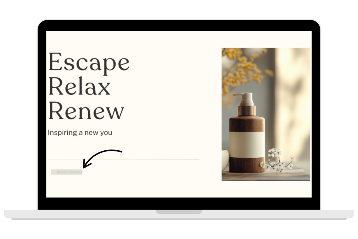
The Scenario
A common design challenge occurs when the desire for a soft, calming aesthetic (like on a spa website) directly conflicts with the need for crisp visual contrast.
The Failure
A web designer is building a website for a luxury spa salon, using a calm, light color palette. The primary call-to-action button, "Book Your Retreat," is styled with a light cream background and a very pale green text label.
Issue 1: Text Contrast Failure: The light green text on the light cream background is only a 1.5:1 contrast ratio, failing the required 4.5:1 minimum. For a user with low vision, the button text blends into the background, making the primary action unreadable.
Issue 2: Element Contrast Failure: The light cream button color against the white background of the website does not pass the 3.1 contrast minimum.
Issue 3: The button is too small and does not pass the 24x24 target size minimum.
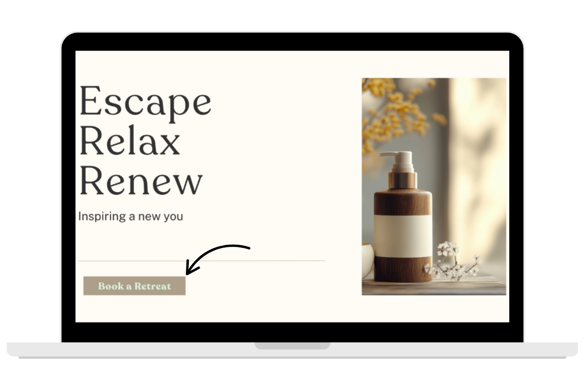
The Solution
The designer can maintain the tranquil aesthetic while achieving full compliance by making strategic color adjustments:
Contrast Fix: Instead of light cream for the button color the designer can choose a brown or rich green and use the cream or light green for the text color, to pass both the text and element required contrast ratios.
Button Size: Making a slight adjustment to the size of the button allows users to easily click or tap it to book their appointment, and passing target size minimums for accessibility.
WCAG Conformance Levels
Level A (Minimum Standard)
Buttons must be defined by more than one sense (i.e. Never say “click the red button” or “choose the circle to proceed”)
Buttons can not only be defined by color
All buttons are keyboard accessible
The purpose of the button is clearly defined by text
Level AA (What’s Really Expected)
Level A criteria PLUS
The minimum contrast between standard size button text and the button color is at least 4.5:1.
The minimum contrast between the button color and the website section background is at least 3:1
The visual focus indicator (the outline that appears when you tab to the button) must have a minimum contrast of 3:1 against the adjacent color to ensure it is clearly visible.
The button's interactive target area must be a minimum of 24 x 24 CSS pixels in size.
Level AAA (Over Achiever)
Level A and AA criteria PLUS
The contrast between standard-size text and button color is at least 7:1.
The button's interactive target area must be a minimum of 44 x 44 CSS pixels in size.
Web Accessibility Initiative
To geek out and go deep on the history and technical criteria for WCAG (Web Content Accessibility Guidelines) W3C is the resource for you.
Recommended Digital Accessibility Resources
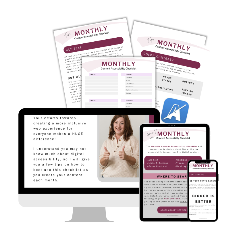
Monthly Content Accessibility Checklist
Easy first steps to track and integrate accessibility into the digital content you create on a regular basis for your business.
Color Contrast Anylyzer
FREE easy to use tool that helps you verify the color contrast throughout your website.

The accuracy of information on this website is subject to change. Implementing these accessibility tips by no means ensures your website is fully compliant with current guidelines or laws. You should consult with a professional to audit and/or remediate your site and obtain an accessibility statement.
©Access Designs LLC | All Rights ReservedLegal ▸ Privacy Policy ▸ Terms ▸ Accessibility Statement