Common Website Accessibility Issues on Coach and Consultant Websites
For a coach or consultant, your website has a lot of work to do before a potential client ever talks to you.
It needs to explain what you do, build trust, show your expertise, and make someone feel comfortable enough to take the next step. That might mean booking a discovery call, filling out an application, downloading a resource, or joining your email list.
When accessibility problems get in the way of those actions, they can quickly become business problems too.
Here are a few issues we see again and again on coaching and consulting websites. Soft brand colors that are difficult to read. Clever headings that do not clearly explain the content below them. Vague links. Intake forms with disappearing labels. Scheduling tools that work perfectly with a mouse but are frustrating with a keyboard.
We have good news though. You do not need to become a website developer or memorize all the WCAG guidelines to start improving many of these things.
Let’s look at the common issues found and where to begin making improvements.
In This Article
Why accessibility issues are common on coach and consultant websites
Forms, applications, and scheduling tools
Keyboard navigation and focus indicators
Inaccessible lead magnets and PDFs
Why Accessibility Issues Are Common on Coach and Consultant Websites
Coaching and consulting websites tend to be very brand-focused.
You want your site to feel like you. Maybe that means soft neutrals, script fonts, large lifestyle photos, carefully styled testimonials, bold statements, animations, or an elegant minimal design.
None of those things are automatically inaccessible.
Problems start when appearance gets prioritized over how easily someone can actually use the site.
Coach and consultant websites also rely heavily on third-party tools. You may have a scheduler, email marketing form, quiz, application form, payment system, chat feature, popup, or course platform connected to your website.
Each new tool adds another place where an accessibility barrier can sneak in. Your visitor does not know or care which element caused the problem. They only know they were trying to work with you and could not complete the next step.
Low Color Contrast
This may be the first place I would look on a coaching or consulting website. Soft colors are everywhere in this industry. Beige, cream, sage, dusty pink, pale blue, light gray, muted gold.
They can create a beautiful brand.
But, they can also make your content disappear.
Low color contrast happens when there is not enough difference between the color of your text and the background behind it. Someone with low vision, color vision differences, aging eyes, or even a person looking at their phone outside in bright sunlight may struggle to read it.
On coaching and consulting websites, check things like:
Body text
Navigation links
Buttons
Testimonials
Pricing or package descriptions
Form instructions
Footer links
Text placed over photos
The guidelines surrounding contrast state that regular text (17pt or smaller) needs a contrast ratio of at least 4.5:1 against its background. Large text (18pt+ or BOLD 14pt+) has a minimum of 3:1.
What You Can Do
You do not have to eyeball this. In fact, you’ll probably be surprised at what passes and what doesn’t.
Use a free color contrast checker and enter your text and background colors. If they fail, try slightly darkening the text or changing the background.
You usually do not need to throw out your entire brand palette. A small adjustment to one shade, just for your links, can make a huge difference while keeping the overall look and feel of your brand.

Not Sure If Your Brand Colors Are Accessible?
You don’t have to guess. The free Color Contrast Analyser lets you compare your text and background colors to see if they meet accessibility guidelines. It’s one of our favorite tools for quickly checking brand colors.
Headings used for design
One of the easiest mistakes to make when using a website builder is choosing a heading style because you like how it looks.
Maybe Heading 3 happens to be the perfect font size, so you use it everywhere.
The problem is that headings have a job behind the scenes too.
They organize your content and create an outline of the page. People using screen readers can navigate directly from heading to heading instead of listening to every word on the page.
They also help everyone else skim your content.
Think about someone landing on your coaching package page. They may want to quickly find your process, pricing, what is included, testimonials, and how to book.
Clear headings make that easy.
Headings such as, How Our Executive Coaching Program Works or What Is Included in Our Consulting Package, tell someone far more than headings like, Ready?, Imagine This, or Here’s the Good Stuff
You can still have personality in your copy. Just make sure the heading tells people what they are about to read.
Keep the Structure Simple
For most small business websites, a good structure is
One clear H1 describing the main topic of the page
H2s for your major sections
H3s for smaller topics within those sections
If you want a heading to look different, change the styling rather than choosing a different heading level just because you like its appearance.
Vague Buttons and Links
Coach and consultant websites LOVE a call to action.
And they should.
But take a look at yours.
How many say…
“Learn More”
“Read More”
“Start Here”
“Click Here”
“Let’s Go”
Those labels may sound perfectly fine when you can see the entire page around them. But your visitors should not have to wonder what happens when they click on it if they can’t see it.
The Web Content Accessibility Guidelines (WCAG) requires the purpose of a link to be understandable from the link itself or its programmatically determined context. For the average business owner, the easiest solution is simply to write clearer link and button text.
Instead of Learn More, try Explore Business Coaching Packages.
Instead of Get Started, try Book a Discovery Call
Instead of Download try Download the Client Planning Guide.
This is good for accessibility, but it is also helpful for SEO and it’ssimply stronger marketing. You are telling people exactly what you want them to do.
Try the Out-of-Context Test
Read the text on your links and buttons without looking at anything around them. Would you know where it takes you?
If not, make it more descriptive.
Want to Start Checking Your Own Website?
WAVE is a free browser tool that can help you spot potential accessibility issues like missing alt text, heading structure problems, form issues, and color contrast concerns. It won’t replace a full accessibility audit, but it’s a great place to start learning what to look for.
Forms, Applications, and Scheduling Tools
Forms may be one of the most important parts of your entire website.
This is where a website visitor turns into a lead.
Coaches and consultants use forms for all kinds of things
Discovery call requests
Coaching applications
Contact forms
Email signups
Lead magnet downloads
Client intake
Assessments or quizzes
If someone makes it all the way to your form and cannot complete it, you have created a barrier at the exact moment they were ready to take action.
Common problems include missing labels, placeholder text being used as the only visible label, confusing required fields, vague error messages, poor contrast, and forms that are difficult to complete with a keyboard.
A field should not simply contain faded text that says “Email” and then it disappears as soon as someone starts typing.
Keep a visible label such as Email Address above the field.
If there are special instructions, explain those too.
And when something goes wrong, tell the user what needs to be fixed. “Something went wrong” is not very helpful. “Enter your email address in the format name@example.com” gives someone something they can actually act on.
Check Your Scheduling Tool
Many coaches and consultants embed a third-party scheduler directly into their website.
Do not assume it is accessible just because it looks fine and works with your mouse.
Try using the Tab key to move through it.
Can you select a date?
Can you choose a time?
Can you fill in your information?
Can you submit the appointment?
Can you clearly see which item you are currently on?
Third-party technology can require more advanced testing, but this quick keyboard check is a good place to start.
Missing or unhelpful alt text
Most coaching and consulting websites use a lot of photography.
Photos of you working with a client. Speaking on stage. Sitting behind your laptop. Leading a workshop. Maybe there are graphics explaining your process, icons representing services, podcast covers, testimonials, or downloadable resources.
Not every one of those images needs alt text.
The question to ask is, Does this image provide information someone would miss if they could not see it?
If yes, it needs an appropriate text alternative.
If the image is purely decorative and does not add information, it should generally be marked as decorative or given empty alt text so a screen reader can skip it.
Be especially careful with images that act as links.
If clicking your Instagram icon opens your Instagram profile, the accessible name should communicate the action or destination rather than simply describing it as “Instagram logo.”
And avoid filling alt text with phrases like “branding photo” or a long list of SEO keywords. Alt text is there to communicate what the image contributes to the page.
Accessible Video Content
Video is a natural fit for coaching and consulting websites. You might use video to introduce yourself, explain your process, share client testimonials, promote a program, or give visitors a preview of what it is like to work with you.
But adding a video to your website also means thinking about how someone will access that information if they cannot hear the audio or see everything happening on screen.
At a minimum, prerecorded videos with spoken audio generally need accurate captions. Captions include the dialogue along with important sounds that help someone understand what is happening.
Do not assume automatically generated captions are ready to go. Tools like YouTube can give you a helpful starting point, but names, industry terminology, punctuation, and other details should be reviewed and corrected.
Transcripts are another useful way to make video content easier to access. A transcript provides a written version of the spoken content and can also include important visual information when needed. This can be especially helpful for longer videos, webinars, interviews, or educational content where someone may want to read, search, or revisit the information instead of watching the entire video.
Keep in mind that a transcript does not replace captions. Captions are synchronized with the video, while a transcript is a separate text version of the content. Depending on the video, providing both can give visitors more ways to access the information in the format that works best for them.
It is also helpful to have the transcript available outside of the video description. Based on the page design, it could be added as text right on the page, or most often a link to the transcript is available just before or after the video.
Some videos may also need audio descriptions when important information is shown visually but never explained in the audio.
For example, if you are demonstrating a worksheet on screen and say, “Fill this section out first,” someone who cannot see the screen may not know which section you mean. Simply saying, “Start with the Goals section at the top of the worksheet,” may provide the information naturally without requiring a separate audio description track.
What You Can Do
Review the videos on your most important website pages and ask:
Do they have accurate captions?
Is there a transcript, and is it available outside the video?
Are important visual details also explained out loud?
Can someone understand the main information without relying only on what they see or hear?
Are the video controls usable with a keyboard?
If you regularly create educational videos, webinars, or online courses, making these steps part of your video process is much easier than trying to go back and fix an entire library later.
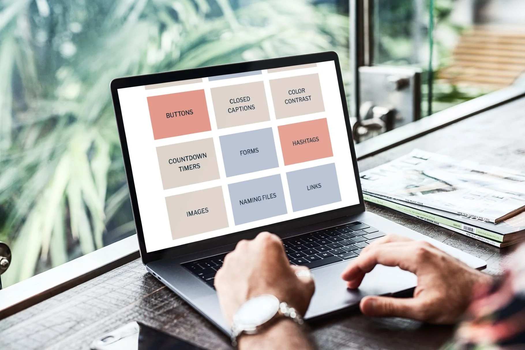
Want to Dig a Little Deeper?
Our free accessibility tutorials break down common website issues without all the technical jargon. Learn how to improve things like links, forms, images, captions, color contrast, and more, one step at a time.
Keyboard navigation and focus indicators
Here is one of the easiest accessibility tests you can do yourself.
Put your mouse down.
Open your homepage and start pressing the Tab key.
You should be able to move through interactive elements such as your navigation, buttons, links, forms, and other controls.
You can use the “enter” or “spacebar” to activate different elements.
As you move, you should also be able to see where you are.
That visible outline or highlight is called a focus indicator.
Do not remove it just because you think it interrupts the design.
Without a visible focus indicator, someone navigating with a keyboard may have no idea which button or link they are about to activate.
Pay particular attention to things like
Dropdown navigation
Popups
Email signup forms
Scheduling tools
FAQ accordions
Testimonial sliders
Embedded third-party tools
If something opens with a mouse but you cannot reach, operate, or close it with your keyboard, that needs further review.
Resolving keyboard navigation issues usually requires professional assistance, but doing this easy test will let you know if you have immediate issues to address.
Inaccessible lead magnets and PDFs
The free guide.
The workbook.
The planning template.
The assessment.
The 27-page PDF explaining your signature framework.
Lead magnets are a huge part of marketing for coaches and consultants, and they are easy to overlook when thinking about website accessibility.
A beautiful PDF created in Canva or exported from another design program is not automatically accessible.
An accessible PDF may need things like proper document tags, heading structure, reading order, meaningful links, alt text for important images, and correctly labeled form fields.
That work can become technical quickly.
So what can you do right now?
Look at the important information you currently provide only through PDFs. Would some of it work better as regular website content?
Your service information, process, FAQs, pricing explanations, or other content someone needs before working with you will often be easier to use and maintain as a webpage.
You can still offer downloadable resources. Just remember that accessibility should continue after someone clicks the Download button.
A Simple Accessibility Check for Coaches and Consultants
You do not need to run a complete accessibility audit today.
Start with the pages closest to getting a new client: your homepage, primary service page, and booking or contact page.
Then ask yourself
Is all of the text comfortable to read against its background?
Do my section headings clearly explain the content?
Do my links and buttons tell people where they are going?
Does every form field have a visible label?
Can I move through the page with my Tab key?
Can I clearly see where my keyboard focus is?
Can I use my booking tool without my mouse?
Have I added useful alt text to meaningful images?
Are important downloads and lead magnets accessible?
Do videos on the page include captions and a transcript?
If you hesitate on any of those, you have found a good place to start.
You do not have to fix everything in one afternoon.
Fix one page. Then another.
And when you add something new to your website, start asking these questions before you publish instead of waiting until accessibility issues pile up.
Build Accessibility Into Your Client Experience
Coaches and consultants put a lot of thought into the experience they create for clients.
You streamline onboarding. Refine your offers. Improve your emails. Update your processes. Make booking easier. Rewrite that welcome packet for the fifteenth time.
Your website deserves that same attention.
A faded text color, confusing button, inaccessible form, or unusable scheduler can seem like a small website problem. But if it prevents someone from learning about your services or reaching out, the effect is much bigger.
Start with the things you can confidently change yourself.
Strengthen your colors. Rewrite unclear buttons. Review your headings. Add better image descriptions. Check your forms.
Then get help with the parts that require more technical testing.
You do not need to become an accessibility expert to create a better experience for your website visitors. You just need to start making accessibility part of how you manage your website moving forward.
We helps small businesses build websites that are accessible, clear, and easier for EVERYONE to use from the start. If you want a professional review of your site’s accessibility, we’d love to take a look.
Coach and Consultant Website Accessibility FAQs
What accessibility issue should coaches and consultants check first?
Color contrast is a great place to start because it is common on highly branded service-based websites and fairly easy to test. Check your body text, buttons, navigation, forms, and other important content with a free contrast checker.
How can I tell if my booking or scheduling tool is accessible?
Start by trying to complete the booking process using only your keyboard. You should be able to select a date and time, complete the required fields, move through the form logically, and submit it without using a mouse.
Do my coaching workbooks and downloadable PDFs need to be accessible?
If you provide digital PDFs or other documents to your audience or clients, accessibility needs to be considered there too. PDFs can be made accessible, but it may require professional assistance if you don’t have training in this area.