

create accessible
FORMS
Goal
Accessible forms help everyone complete tasks without confusion or frustration. This includes people using screen readers, keyboard-only users, people with low vision, people with cognitive disabilities, and anyone who’s ever struggled to understand what a form was asking for.
This tutorial walks you through simple, practical steps to make common forms accessible — like contact forms, intake forms, registration forms, or quote requests.
Quick Wins (Start Here)
If you only do a few things, start with
Use clear labels above each field
Add helpful instructions when needed
Ensure color contrast meets accessibility guidelines
Add error messages that explain what went wrong
These changes solve most form accessibility issues immediately.
Note: Creating truly accessible forms is quite technical, so we highly recommend have a professional review these for you to ensure full accessibility.
Use Clear Labels
A label is the words above each input field and tells the user what to enter in each field. Every single field needs one.
Good labels
Name
Email Address
Phone Number
Message
Avoid
Blank fields
Placeholder-only labels (“Enter name…”)
Cute or vague labels (“How should we call you?”)
Why this matters
Screen readers rely on labels to announce what each field is. Visual users also need to see what information is needed in each field.
Don’t Rely on Placeholder Text
Placeholder text is the text inside an input field and disappears when someone starts typing. This text is often completely skipped by screen readers.
Use placeholder text only for examples, not instructions.
Example
Label: Phone Number
Placeholder: 555-123-4567
This helps users without losing important context.
Keep Instructions Simple and Visible
If a field has rules, give instructions before the user has the opportunity to make a mistake.
Examples
Password must be at least 8 characters
Your message must be under 500 characters
Business name required for quote requests
Keep your instructions short and written in plain language.
Use the Right Input Type (Semantic HTML, Explained)
Semantic HTML just means using fields that match the information you’re collecting. If you are using a website builder you likely will not see orhave access to the actual code and options will very from one platform to another.
Follow these guidelines
Use common inputs when available → Name, Email, and Phone number are almost always available to select when building a form. Do NOT choose a basic “text” field to replace available options like these.
Checkboxes → for yes/no or multiple options
Radio buttons → for choosing one option
Dropdowns → for long lists or specific choices
Keep Color Contrast Strong
People must be able to read the text inside form fields and see the borders clearly.
Things to check
Field borders
Field labels
Error messages
Placeholder text
Make Error Messages Clear and Helpful
If a user makes a mistake, tell them:
What went wrong
How to fix it
Examples
✔ “Please enter a valid email address.”
✔ “This field is required.”
✔ “Message is too long. Maximum 500 characters.”
Avoid
✘ “Error.”
✘ Highlighting the field in red with no explanation.
Place the error message near the field, not just at the top of the form.
Support Keyboard Navigation
Some people cannot use a mouse. All form fields must be reachable with the Tab key. Website builders generally have this capability built in for you.
You can check that users are able to
Tab into fields
Move between fields
Activate buttons
Check checkboxes
Submit the form
Exit the form without submitting
This ensures your form is usable for keyboard-only and switch device users.
Use Clear, Descriptive Button Text
Good buttons tell users exactly what will happen.
Good
Submit
Send Message
Request Quote
Sign Up
Avoid
Click Here
Go
OK
This supports clarity and screen reader usability.
What To Do
How to Create Accessible Forms
Example

Imagine you’re designing a website for a photographer who wants clients to submit a booking inquiry.
Accessible Form
Label: Full Name
Label: Email Address
Label: Preferred Shoot Date
Instructions: “You’ll receive a reply within 48 hours.”
Strong contrast on all text and borders
Helpful error message: “Please enter a valid email address.”
Button: Request a Session
Non accessible form
Placeholders only (no label outside the input field)
Light gray text inside the white fields
Error message simply says “Error”
Button labeled “Go”
User cannot tab to exit the form
The accessible version is clearer, easier to complete, and usable by everyone.
Tips and Common Mistakes
Do
Every field needs a label
Keep instructions plain and helpful
Break up long forms into sections with section labels (i.e. Contact Information, Shipping Information, Payment Information)
Ensure strong color contrast
Add meaningful error messages
Test the form with a keyboard only
Avoid
Placeholder text unless absolutley necessary
Fields without clear purpose
No or light colored borders
Vague error messages
WCAG Guidance
WCAG 1.3.1 Info and Relationships
WCAG 1.3.5 Identify Input Purpose
WCAG 1.4.3 Contrast (Minimum)
WCAG 2.1.1 Keyboard
WCAG 3.3.1 Error Identification
WCAG 3.3.2 Labels or Instructions
These guidelines support clarity, structure, and usability across all devices.
Next Steps
Once your forms are accessible, explore
Each piece works together to improve your website’s overall accessibility.

Want Help With accessibility?
If you’d like professional support, we can help:
We offer a full suite of digital accessibility services.
Web Accessibility Initiative
To geek out and go deep on the history and technical criteria for WCAG (Web Content Accessibility Guidelines) W3C is the resource for you.
Recommended Digital Accessibility Resources
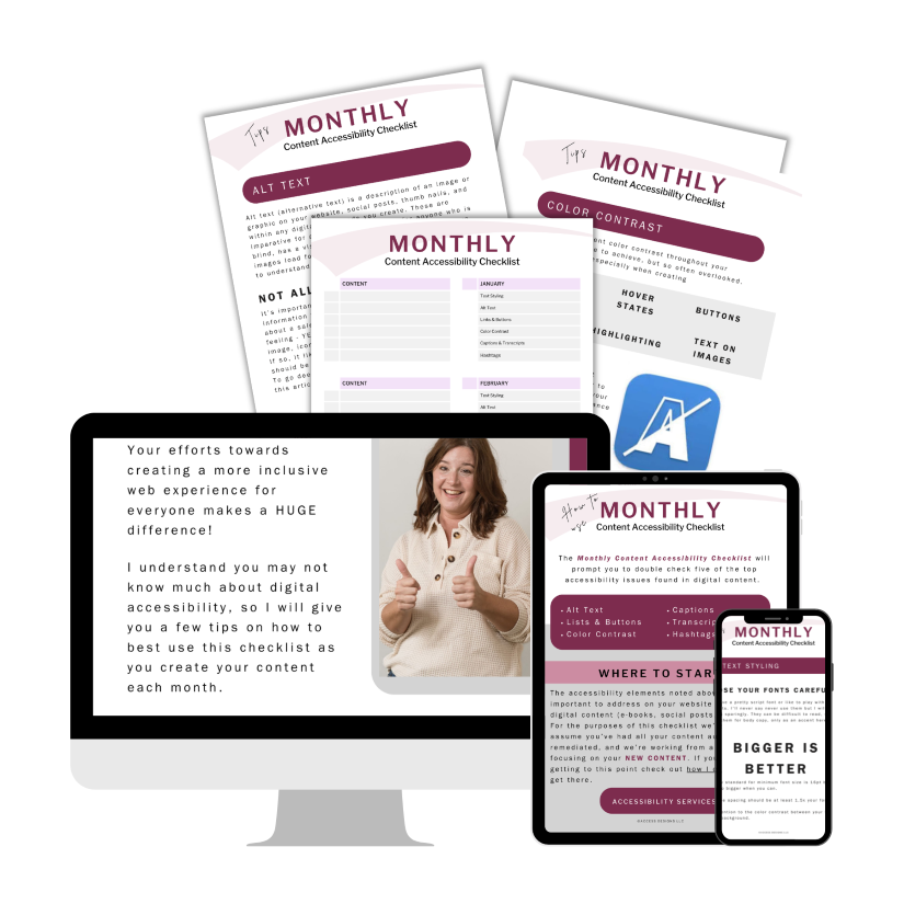
Monthly Content Accessibility Checklist
Easy first steps to track and integrate accessibility into the digital content you create on a regular basis for your business.
Color Contrast Anylyzer
FREE easy to use tool that helps you verify the color contrast throughout your website.

The accuracy of information on this website is subject to change. Implementing these accessibility tips by no means ensures your website is fully compliant with current guidelines or laws. You should consult with a professional to audit and/or remediate your site and obtain an accessibility statement.
©Access Designs LLC | All Rights ReservedLegal ▸ Privacy Policy ▸ Terms ▸ Accessibility Statement