

create accessible
IMAGES
Goal
Images show up everywhere — websites, social media, PDFs, newsletters, and blog posts.
Making them accessible ensures people who are blind, low vision, or using screen readers can understand your content.
This tutorial explains the three main types of images you’ll use online and the simplest way to make each one accessible.
Quick Wins (Start Here)
If you only do a few things, start with these
Add alt text to meaningful images
Mark decorative images correctly
Give functional images clear descriptions
Avoid placing text inside images
Make sure images have good color contrast when used as buttons
These steps fix most common image accessibility issues.
The Three Types of Images
Most images fall into one of these categories:
Informative images — communicate something important
Decorative images — add visual style only
Functional images — act as a button or link
What To Do
How to Improve Image Accessibility
Informative Images
These images share something meaningful or educational. They enhance the surrounding content.
Your job is to explain the content of the image in alt text, so everyone gets the same information, regardless of their ability to actually see the image.
Examples of informative images
Charts and graphs
Product photos
Step-by-step images in a tutorial
Photos showing location, people, or objects
Infographics
Screenshots demonstrating a process
How to handle them
Write alt text that describes the important information in the image. Keep it short and clear.
Examples
“Chocolate cupcake topped with salted caramel frosting.”
“Bar chart showing website traffic increasing from January to March.”
“Screenshot of a settings menu with the Accessibility option highlighted.”
If the image is complex (like a data-heavy infographic), place a longer text description below the image, not inside the alt text.
Decorative Images
These images don’t add meaning — they’re there to make your page feel friendly or visually appealing.
Examples of decorative images
Background patterns
Borders or dividers
Stock photos not tied to the content
Icons used only for style
How to handle them
Mark them as decorative in your website builder or enter empty alt text (alt="").
This tells screen readers to skip the image so users don’t hear “Image, dot, dot, dot…”
Use decorative tagging any time the image does not help someone understand your content.
Functional Images
These images work like buttons or links.
Their purpose isn’t the image itself — it’s the action the image triggers.
Examples
A magnifying glass icon that opens search
A shopping cart icon that takes users to checkout
A “Download PDF” image
Social media icons
Clickable logo
How to handle them
The alt text needs to describe the function, not the picture.
Examples
“Search”
“Go to checkout”
“Download pricing guide PDF”
“Visit our Instagram page”
“Home” (for a logo that links to the homepage)
Never describe functional images visually (like “blue shopping cart icon”).
Describe what they do.
Other Best Practices for Images
Avoid Text Inside Images
If you put text in an image, screen readers cannot read it.
This is especially important for:
Flyers
Event graphics
Sale promotions
Social media posts
If you must use image-based text, repeat the text in the alt text or body copy.
Keep Color Contrast Strong
If your image is used as a button or contains important information, make sure the contrast is high.
Use Captions
Captions help explain context, especially for:
Before-and-after photos
Team photos
Location photos
Portfolio images
Captions are not a replacement for alt text, but they pair well with it when you need to provide more context to an image.
Example

You are the owner of a handmade candle business updating product photos on your website.
Informative Image
Photo shows your “Lavender & Lemon” candle.
Alt text: “Lavender and lemon scented soy candle in a glass jar with dried lavender beside it.”
Decorative Image
A subtle lavender illustration behind the product description.
Marked as decorative.
Functional Image
A small shopping cart icon linking to checkout.
Alt text: “View cart.”
Using the three image types ensures your product page is clear and accessible for everyone.
Tips and Common Mistakes
Do
Identify the type of image before writing alt text
Keep alt text short and meaningful
Use empty alt text for decorative images
Describe function for functional images
Provide longer text descriptions for complex graphics
Avoid
Writing “image of…” or “link for…” in alt text
Leaving alt text blank for important images
Using vague alt text like “photo” or “graphic”
Putting long paragraphs inside alt text
Forgetting to label functional icons
WCAG Guidance
WCAG 1.1.1 Non-text Content
WCAG 1.4.3 Contrast (Minimum)
WCAG 2.4.4 Link Purpose (In Context)
These guidelines help to ensure images provide clarity and meaning, and screen reader users are given equivalent information that sighted users have access to.
Next Steps
Once you hve conquered image accessibility, explore
Putting all of these accessible elements together helps grow your inclusive brand.

Want Help With accessibility?
If you’d like professional support, we can help:
We offer a full suite of digital accessibility services.
Web Accessibility Initiative
To geek out and go deep on the history and technical criteria for WCAG (Web Content Accessibility Guidelines) W3C is the resource for you.
Recommended Digital Accessibility Resources
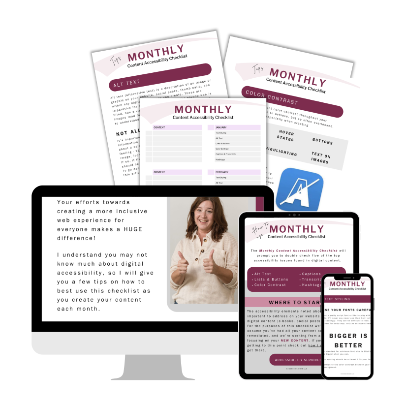
Monthly Content Accessibility Checklist
Easy first steps to track and integrate accessibility into the digital content you create on a regular basis for your business.
Color Contrast Anylyzer
FREE easy to use tool that helps you verify the color contrast throughout your website.

The accuracy of information on this website is subject to change. Implementing these accessibility tips by no means ensures your website is fully compliant with current guidelines or laws. You should consult with a professional to audit and/or remediate your site and obtain an accessibility statement.
©Access Designs LLC | All Rights ReservedLegal ▸ Privacy Policy ▸ Terms ▸ Accessibility Statement