Common Accessibility Issues on Photography Websites
Photography websites are meant to make an impression. Large portfolio images, full-screen sliders, soft typography, and minimal layouts are all part of the look many photographers want.
But those same choices can also create problems for your potential clients.
A homepage headline that disappears into a bright image, a gallery that only works with a mouse, or a contact form that looks perfect but is frustrating to fill out can all make a photography website harder to use.
In some cases, people may leave before they ever view your work or send an inquiry.
Accessibility problems on photography websites are often tied to the very design choices meant to make the site feel elevated and professional.
The good news is that fixing these issues does not mean sacrificing your visual brand. It means making adjustments to ensure your website is easy to read, easy to navigate, and easier to use for ALL your potential clients.
When people cannot comfortably browse your work, find information, or complete your form, accessibility stops being a website issue and starts becoming a business issue.
In this post, we’ll walk through the most common accessibility issues found on photography websites, what they look like in real life, and how to fix them in a way that still fits your style.
In This Article
Why photography websites have accessibility problems
Motion, autoplay, and flashy effects
Why Photography Websites Have Accessibility Problems
Photography websites usually lean heavily on large images, minimal text, motion effects, gallery plugins, and custom navigation. None of those things are automatically bad. The problem is that they are often implemented in ways that hide information, remove structure, or make the site harder to use.
Some common examples are
the home page opens with a full-screen slideshow
text is placed on top of images
navigation is tiny or tucked away
gallery pages rely on hover effects
the contact form looks stylish but is missing the basics that make it easy to complete.
The site may look beautiful at first glance, but still be frustrating for someone trying to read, navigate, or get in touch, especially if they are using assistive technology.
That is why photography websites often need a more intentional accessibility review than people expect. There is a lot of cool design and features, they just aren’t working well together for your users.
Missing or Vague Alt Text
Alt text is one of the most talked-about parts of accessibility, but it is still mishandled all the time.
On photography websites, the problem usually shows up in one of three ways.
The images have no alt text at all.
The alt text is stuffed with keywords.
Every image gets the same generic description, like “wedding photo” or “branding session.”
That does not help someone understand what is actually in the image.
For a photography website, this matters because your images are not just decoration. They are a big part of how people understand your style, your subject matter, and the kind of work you want to book.
If someone is browsing your wedding portfolio, “photo” tells them absolutely nothing. “Bride and groom laughing during an outdoor sunset ceremony” gives actual context.
How to fix alt text on photography websites
Write alt text based on the purpose of the image on that page.
Describe what is meaningful, not every tiny detail.
Avoid keyword stuffing like “wedding photographer Nashville wedding photography image.”
If an image helps show your work, describe the scene in a natural, useful way.
If an image is purely decorative, use null alt text, which means leave the alt text empty so it does not add clutter for screen reader users.
If the image is also a link, make sure the alt text helps explain where that click leads (i.e. “Read our guide on preparing for your headshots.”).
Continue Learning
Before you write your alt text, decide what job your image is doing on your website.
Low Contrast Text
White text over a bright sky. Beige text over a warm-toned image. Thin gray menu links floating on top of a hero banner. It may match the brand aesthetic, but if the text does not stand out enough, many people are going to struggle to read it.
This shows up a lot on photography sites because the image is usually treated as the star, and the text gets layered on top afterward. The result may look elegant, but not work well in practice.
Think about a homepage headline placed over a bright beach session or a family photo with lots of soft neutral tones. It may look subtle and stylish, but subtle is not the same thing as readable.
How to fix low contrast without ruining the design
Add a darker or more solid overlay on hero images.
Move important text onto a solid background block when needed.
Use a semi-transparent background behind your text.
Check buttons, links, and menu text too, not just headings.
Test the contrast using a color contrast checker.
Continue Learning
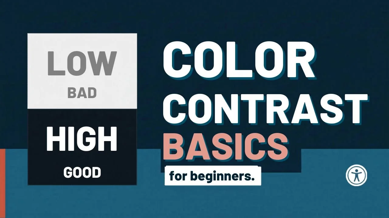
Just learning about accessibility? No worries, Start here to learn about color contrast basics.
Image Galleries and Sliders
Photography websites love sliders, lightboxes, carousels, category filters, and full screen galleries. The problem is that many of these features are built in a way that assumes every visitor uses a mouse or touch screen.
If someone cannot tab into the gallery controls, open an image, move to the next slide, or close the lightbox without getting stuck, that gallery is not working the way it should.
A lot of photographers never notice this because their site was only ever tested with a mouse. But someone else may be using only a keyboard, voice control, or other assistive technology.
Picture a potential client opening your portfolio gallery and being unable to close a popup once it opens. That is not just inconvenient. It is a dead end, giving them only one choice, to leave your website.
How to fix inaccessible galleries and sliders
Test every gallery and popup using only the keyboard.
Make sure you can tab to the gallery controls.
Make sure you can open, move through, and close the gallery without a mouse.
Make sure there is a visible focus indicator so users can tell where they are on the page.
If there are any navigation issues with your gallery or slideshows, this is likely something you won’t be able to fix yourself and will need to hire a professional to help with.

We helps small businesses build websites that are accessible, clear, and easier for EVERYONE to use from the start. If you want a professional review of your site’s accessibility, we’d love to take a look.
Difficult Navigation
Minimal navigation is popular on photography websites. Sometimes that means tiny menu text, vague labels, or hamburger menus that are hard to open. Other times, the page starts with a huge hero section or slideshow that people have to work through before they can reach the actual content.
This may not seem like a big deal at first, but it can cause someone to leave your site without ever exploring your services.
For example, if someone lands on your site looking for pricing or your contact page, they should not have to guess whether it is under “Experience,” “Details,” or some other vague label. Maybe you have a hamburger menu but you’ve styled it in a fun and funky way that isn’t familiar to people as a menu. Or Your main navigation sits over your hero section with scrolling images and the text occasionally disappears due to low contrast.
You only have a few seconds to capture someone’s attention and help them get the information they need, so making that as easy as possible should be priority.
How to fix navigation issues
Use clear menu labels like Portfolio, About, Pricing, and Contact.
Make sure the menu can be opened and used with a keyboard.
Add a skip link so keyboard users can jump past repeated content and get to the main part of the page faster.
Keep navigation easy to find on both desktop and mobile.
Ensure your menus always have enough color contrast.
Images of Text/Infographics
Photography brands often use graphics for promotional banners, pricing snippets, or testimonials because they want full control over the visual presentation.
The problem is that when important words are built into an image instead of added as real website text, they can become harder to read, harder to resize, and often times impossible for assistive technology to understand.
For example, maybe you have an infographic showing the packages you offer and you’ve uploaded that to your website as an image or PDF. It may look beautiful, but if the PDF is not accessible or the text is not available as real text on the page, some visitors are going to completely miss it.
How to fix text baked into images
Build any important information on your actual website instead of uploading a PDF or infographic.
If you offer a PDF ensure it is accessible.
Infographics must have detailed alt txt explaining the content.
Verify readability on mobile for any images with text.
Poor Heading Structure
A lot of photography websites are designed visually first and structurally second. That often leads to skipped heading levels, oversized text that looks like a heading but is not actually marked as one, or pages with no clear content structure at all.
This matters because headings help people understand the layout of the page and quickly find what they need, whether they are quickly skimming it or using a screen reader.
Think about a portrait photographer’s service page. If everything is just styled text blocks with no real structure, it becomes harder to scan. But if the page is clearly broken into sections like Portfolio, Session Details, FAQs, and Contact, it is easier to follow.
That is good for readers, and it also helps search engines make sense of the page.
How to fix heading structure
Use one clear H1 for the main topic of the page.
Break the rest of the page into logical H2 sections.
Use H3s only when they belong under an H2.
Do not choose heading levels based only on how they look.
Make sure each section has a clear purpose and label.
Think about how someone would scan the page quickly.
For example, a wedding photography page might be structured like this
H1: Wedding Photography in Nashville
H2: What’s Included
H2: Portfolio Highlights
H2: Frequently Asked Questions
H2: Contact
That kind of structure makes the page easier to follow.
Continue Learning
Discover 7 common mistakes with headings found on most websites.
Motion, Autoplay, and Flashy Effects
Photography sites often use autoplay slideshows, parallax effects, fade-ins, hover animations, and video backgrounds. These can look polished, but they can also distract users, hide content, or make the site harder to navigate.
A full screen slideshow that starts moving before someone can finish reading the headline is a good example. So is a portfolio section where important details only appear on hover, or a background video that pulls attention away from the actual content.
Motion is not always the problem. Unnecessary motion is.
How to fix motion and media issues
Avoid autoplay when possible.
Give users control over sliders and videos.
Keep movement subtle and purposeful.
Do not rely on hover alone to reveal important information.
Make sure motion does not interfere with reading or navigation.
Add captions to videos with spoken content.
What photographers should prioritize first
If you are looking at your photography website and wondering where to begin, start with the areas that affect basic use and inquiries the most.
You do not need to fix every page, every gallery, and every image all at once. Start with the pages people rely on before they decide to work with you.
Your homepage
Your main portfolio or gallery pages
Your services or pricing page
Your contact or inquiry page
These are the pages potential clients use to decide whether your style, services, pricing, and personality are the right fit. If those pages are hard to read, hard to navigate, or hard to use, people may leave before they ever reach out.
Prioritize the fixes that affect inquiries
Once you know which pages matter most, focus on the issues that get in the way of someone browsing your work or contacting you.
Start with
Improving text contrast, especially text layered over images
Adding meaningful alt text to important portfolio images
Making sure your navigation is clear and easy to use
Testing galleries, sliders, and lightboxes without a mouse
Using real text instead of important information baked into graphics
Fixing headings so each page is easy to scan
Reviewing your contact form to make sure it has clear labels, instructions, and error messages
Your contact form deserves special attention. If someone can browse your work but cannot easily send an inquiry, your website is not doing its job.
Make your portfolio easier to experience
For photographers, the portfolio is often the heart of the website. That does not mean every image needs a long description, but the gallery should still be usable.
Someone should be able to move through your work, understand the type of photography you offer, and close any popups or lightboxes without getting stuck.
Start with your most important portfolio category first. For example, if weddings are your main service, review that gallery before spending time on older blog posts or less important image collections.
Final Thoughts
Accessibility does not mean making your website boring. It means making sure more people can actually experience your work, move through your site, and reach out when they are ready to work with you.
Photography websites benefit a lot from thoughtful accessibility because they rely so heavily on presentation. When the visuals are supported by clear structure, readable text, usable forms, and easy navigation, the entire site becomes better.
That is better for your visitors, and your business.
Photography Website Accessibility FAQs
Do photography websites need alt text for every image?
Not always. If an image helps someone understand your work, it should have meaningful alt text. If it is purely decorative, you can use null alt text, which means leaving the alt text empty so screen readers skip it.
Can a photography website still look high-end and be accessible?
Yes. Accessibility does not prevent a site from being beautiful. It usually means making smarter choices around contrast, navigation, text, structure, and interaction. Many of these improvements are done behind the scenes and don’t effect the visual appearance of a website.
What is the most common accessibility issue on photography websites?
Missing or inaccurate alt text and low contrast on text that overlays an image or video.
Are accessibility widgets enough for a photography site?
No. Widgets and overlays do not replace accessible design, content, and development. Real accessibility work happens in the site itself.
What should photographers fix first?
Start with the things tied most closely to usability and inquiries: text contrast, navigation, galleries, alt text, headings, and your contact form.