Common Accessibility Mistakes on Restaurant Websites
If you’re a restaurant or café owner your website should show off your menu, give your hours, let people make a reservation or place an order, provide directions, or help people figure out whether your restaurant is a good fit for their current craving. When those basic tasks are easy for people, that means your website is supporting your business. If any of these pieces are missing or not setup correctly, you’re unknowingly sending the dinner rush to your competitors.
Website accessibility is not just about rules or guidelines. It is about making sure people can actually use the information you worked hard to put online. If someone cannot read your menu, use your reservation form, or find your hours without frustration, that becomes a real business problem.
Even though these issues are common throughout the industry, the good news is that most problems are easy to spot, and quick to fix.
In This Article
Why restaurant websites often struggle with accessibility
Sharing specials, hours, or important updates as graphics
Hard to read stylish design choices
Buttons and links are too vague
An accessibility widget is not the solution
Why restaurant websites often struggle with accessibility
Restaurant websites tend to be very visual. That makes sense. You want the site to reflect the atmosphere, the food, and the brand.
But restaurant websites also tend to rely on things that create friction fast like PDF menus, image-based specials, light text over photos, hard-to-use reservation tools, confusing mobile layouts, and homepage designs that look beautiful but make key information harder to find.
That is usually where the trouble starts.
Accessibility guidelines are meant to help websites work better for more people, including disabled visitors, and those improvements often make the site easier for everyone else too.
PDF or image-based menus
This is one of the biggest mistakes restaurant websites make.
A lot of restaurants upload a menu as a PDF or a scanned file (turning it into a image) because it is quick and easy. The problem is that these formats are often harder to read on a phone, harder to zoom in on, and impossible for visitors to use with assistive technology.
And on a restaurant site, the menu is not a side detail. It is usually the main reason someone came to the website in the first place.
If customers have to pinch and zoom, struggle to read tiny text, or give up because the menu is an image with no accessible content, you’re losing business.
A better approach is to have the menu built directly on the page in clear text. That way people can read it more easily, enlarge it if needed, and move through it without as much frustration. A downloadable version can still be offered, but it should not be the only version AND the PDF must be made accessible.
Sharing specials, hours, or important updates as graphics
This happens all the time on restaurant websites and social media feeds.
Maybe the brunch menu is posted as a graphic. Maybe holiday hours are saved as a flyer. Maybe allergy notes or event details are turned into a cute visual instead of plain text on the page.
The problem is not that graphics exist. The problem is when important information only lives inside an image.
If someone is trying to quickly check whether you are open on a holiday, whether there is a gluten-free option, or what time live music starts, that information should be easy to read and easy to find.
If it matters to the customer, it should be written clearly on the page, not provided solely in an image or infographic.
Hard to read stylish design choices
Restaurants often want a site that feels warm, elevated, modern, or moody. That is completely understandable. But sometimes the design choices start working against the content.
This usually shows up as text over food photography, fonts that are hard to read, or very small text for things like prices, addresses, or reservation details.
It may look polished at first glance, but if people have to work to read it, the design is working against you.
Your website does not need to look plain to be accessible. It just needs to be readable. In most cases, that means making sure the contrast is stronger, the font is clear, and the important details are easy to scan.
Frustrating reservation forms
Restaurant websites depend on forms more than many owners realize.
Reservation requests, private dining inquiries, catering forms, contact forms, waitlists, and event bookings all depend on one thing: people being able to complete the form without confusion.
Common issues include labels disappearing once someone clicks into a field, required questions not being obvious, date and time fields not working with assistive technology, error messages not explaining what needs to be fixed, and of course, some third-party reservation tools are simply harder to use than they should be.
For a restaurant, that can mean lost reservations, lost event leads, and lost orders.
This is an important area to involve an accessibility specialist. Forms can look completely fine and seem usable to the average user, but hidden backend issues can make a form completely inaccessible.
Assuming people will call
Sometimes restaurant or café websites are built just as a landing page, and owners think people will call if they have questions. But many customers do not want to call. They want to check the menu, reserve online, look up hours, or place an order from their phone without having to talk to anyone.
That doesn’t mean remove your phone number. It just should not be the only way people can contact you.
If your website makes people call to make a reservation, inquire about special dietary options, or order to go food, that creates unnecessary friction. A good restaurant website respects how people actually prefer to interact today.
Hiding important information
Some restaurant websites are so focused on the experience that they forget the basics.
There may be a large video banner, a scrolling image section, a social feed, a popup, and a long homepage story before someone can even find the hours or menu.
That may feel immersive from a branding perspective, but most visitors are there for a quick answer. They want to know
Are you open right now?
What is on the menu?
Can I make a reservation?
Do you offer online ordering?
Where are you located?
Do you have parking info, or dietary options available?
If those answers are hard to find, the website is not supporting the customer’s needs.
Buttons and links are too vague
Words like “Click Here,” “Learn More,” or “View” don’t provide much context.
Restaurant websites work better when buttons are specific. “Reserve a Table” is clearer than “Book Now” if there are multiple actions on the page. “View Happy Hour Menu” is more helpful than “See More.” “Order Pickup” is better than “Start Here.”
Clear wording reduces confusion and helps people move faster.
This is one of those small fixes that improves the experience right away.
Poor mobile experience
Most restaurant traffic is mobile. People are looking up places while they are out, texting friends, deciding where to eat, or checking your hours from a parking lot.
That means a restaurant website needs to work especially well on a phone.
Common problems include menus that are hard to open, pages that become awkward when someone zooms in, buttons that are too small to tap, popups that take over the screen, and ordering or booking tools that feel clunky on mobile.
A restaurant site should make quick decisions easier, not harder. If mobile visitors have to fight the layout just to find your dinner menu or book a table, they’re going to find other options.
Videos without captions
Video can be a great tool for restaurant marketing. It can show the space, the vibe, the plating, the team, or the atmosphere during service.
But if a video doesn’t include captions, some visitors miss that content entirely. This goes beyond accessibility. Approximately 85% of people watch videos without the sound turned on.
So, if you are using video to introduce the restaurant, explain a upcoming event, or highlight weekly specials, captions are non-negotiable.
An accessibility widget is not the solution
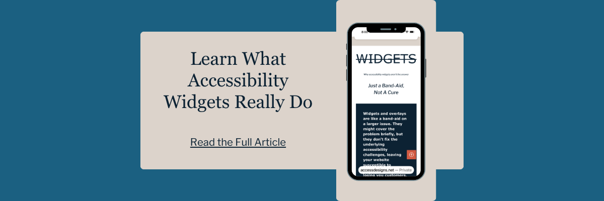
A widget or overlay is not a real fix for an inaccessible restaurant website. It does not solve a hard-to-read menu, confusing navigation, missing information, or a frustrating booking form.
Accessibility works best when the website itself is built right from the start.
That means clearer text, simpler navigation, readable colors, better forms, and important information written plainly on the page.
Accessibility widgets often create more barriers then they resolve. Most people with a disability have the tools they need setup the way they need them to navigate the web. So if you build your website correctly, they can access what they need, and the user experience for every other visitor will be smoother too.
What restaurant owners should check first
If you want to improve your restaurant website without getting overwhelmed, start with the things customers use most.
Look at your menu first. Is it easy to read on a phone? Can someone enlarge it without everything becoming a mess? Are prices and descriptions clear? Is it available directly on your website, and not just in a PDF?
Then check your hours, address, and reservation options. Make sure those details are easy to find and do not require digging.
After that, look at ordering, catering inquiries, and event forms. Try filling them out yourself. If anything feels confusing, rushed, or clunky, your customers are probably feeling it too.
This does not have to be complicated. Focus on fixing one thing at a time. Ask your customers how their online experience was and if they ran into any trouble ordering or booking. There is no better feedback then that of the people actually engaging with your business.

We helps small businesses build websites that are accessible, clear, and easier for EVERYONE to use from the start. If you want a professional review of your site’s accessibility, we’d love to take a look.
Restaurant Website Accessibility FAQS
What is the most common accessibility problem on restaurant websites?
Usually it is the menu. Many restaurants post menus as photos or scanned files, which can make them harder to read and impossible to use.
What should a restaurant fix first on its website?
Start with the parts tied most closely to customer action: the menu, hours, reservations, ordering, and contact information.
Does accessibility matter if most of our customers use phones?
Yes. Especially then. Accessibility and mobile usability often overlap. If a site is hard to read, hard to tap through, or hard to zoom on a phone, that affects a lot of customers.
Are accessibility widgets or overlays a good fix for my restaurant?
No. We never recommend overlays as a solution. These "quick fixes" fail to resolve the underlying code issues and can actually interfere with the assistive technology that people with disabilities already use.
Do I have to get rid of my PDF menu entirely?
You don't have to delete it, but it shouldn't be the only option. The best practice is to have a fully accessible, text-based menu on your website first, and then provide an accessible PDF version as a secondary download for those who want to print it.
How do I know if my website's colors have enough contrast?
There are many free tools available online where you can plug in your "HEX codes" (the specific codes for your colors) to see if they pass the 4.5:1 ratio. If you’re unsure, an accessibility review is a great place to start.
Ready to make your restaurant more welcoming?
Your website should be as inviting as your dining room. At Access Designs LLC, we help small businesses build inclusive brands that expand their reach and connect with more people.
Book a consultation today to ensure your website is serving every customer who walks through your doors.
For more tips on inclusive design, visit our tutorials or explore our YouTube channel.