

Website Form Basics for Beginners
Most business websites have one main job: help visitors take action.
That action might be filling out a contact form, requesting a quote, booking an appointment, signing up for a class, joining your email list, or completing a purchase. In almost every case, that action depends on a form.
So, here’s the question: can every visitor complete the forms on your website?
If your form is confusing, poorly labeled, hard to see, or difficult to use with a keyboard or other assistive technology, some people will not be able to finish it. That means lost inquiries, abandoned signups, missed sales, and a less welcoming experience for the people trying to connect with your business.
Let’s walk through the basic parts of an accessible web form and what each part is for.
In This Article
Why Accessible Forms Matter for Small Business Websites
Add Instructions for More Context
Do Not Rely on Placeholder Text
Use Field Instructions When Appropriate
Make Input Fields Easy to See and Use
Accessibility Details Beyond the Basics
Why Accessible Forms Matter for Small Business Websites
Forms are often where interest turns into action.
A visitor can read your homepage, browse your services, and look at your portfolio. But when they decide to reach out, book, register, or buy, the form becomes the bridge between browsing and becoming a customer.
When that bridge is broken, people leave.
That does not only affect people who use screen readers or other assistive technology. It can affect someone using a keyboard because their mouse is not working. It can affect someone with low vision who cannot read faint text. It can affect someone on a phone trying to fill out a long form quickly. It can affect someone who gets distracted and needs clear labels to remember what each field is asking.
That is why accessibility enhances usability. A clearer form is better for everyone.
The W3C’s Web Accessibility Initiative explains that accessible forms need clear labels, instructions, validation, and feedback so people can complete them successfully. (Learn more about accessible forms at W3.org)
Start With a Clear Form Title
Every form should begin with a clear heading that tells people what the form is for.
Think of the form title like a sign on a door. Before someone walks in, they should know where they are going. Is this a contact form? A newsletter signup? A quote request? A registration form? A donation form?
A vague heading like “Get Started” might sound nice, but it does not always give enough context. A clearer heading, such as “Request a Quote” or “Contact Us,” helps visitors understand exactly what they are about to do.
This is especially helpful when a page has more than one form or when someone is navigating quickly using headings or assistive technology.
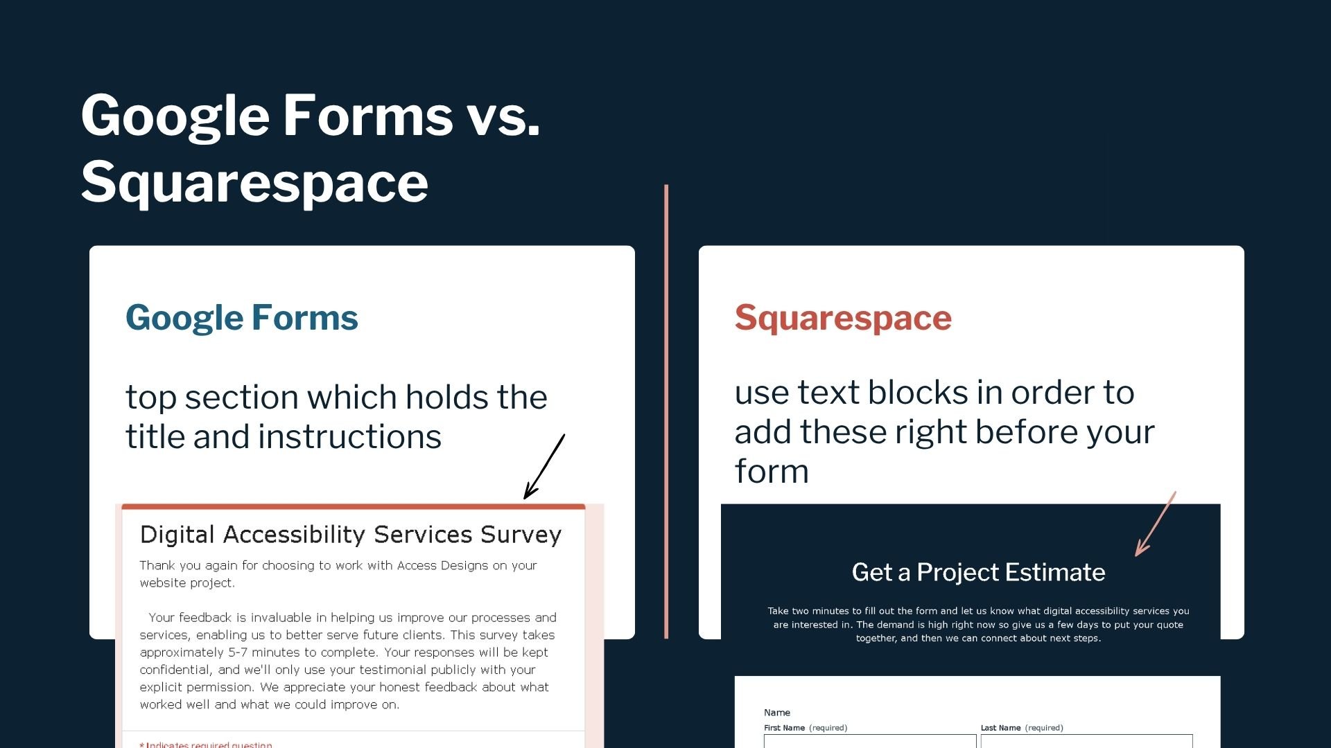
Add Instructions for More Context
Not every form needs a long explanation. A simple newsletter signup may only need a clear title and an email field. But some forms do need instructions.
Form instructions can explain what the form is for, how the information will be used, what fields are required, or what someone should expect after submitting. For example, a consultation request form may explain that someone will receive a response within two business days. A class registration form may explain that payment is required to reserve a spot.
Instructions are also helpful when your form has specific rules, such as:
Fields marked with an asterisk are required.
Use MM/DD/YYYY for dates.
Select all options that apply.
Upload a PDF or Word document only.
On some platforms, like Google Forms, there is a built-in area for a form title and description. On other platforms, like website builders, you may need to add a regular text block above the form. The platform matters less than the outcome: the person filling out the form should know what the form is asking and what they need to do.
Use Proper Form Labels
Form labels are the words that tell people what each field is asking for.
Common labels include
First Name
Last Name
Email Address
Phone Number
Address
Message
The important part is that the label should be visible outside the field, not only inside the box.
This matters because the text inside a form field often disappears once someone starts typing. If that disappearing text is the only label, the person may lose the context of what they are filling out. They may type something, pause, come back, and no longer know what that field was asking for.
A good label is simple and direct. Instead of “Your Info,” use “Email Address.” Instead of “Details,” use “Tell Us About Your Project.”
Clear labels reduce guessing, and guessing is where mistakes happen.

Do Not Rely on Placeholder Text
Placeholder text is the light gray text that appears inside a field before someone types.
Sometimes it says something like “name@email.com” or “Mary Smith.” It may seem helpful, but placeholder text can create problems when it is used as the only instruction.
The biggest issue is that placeholder text usually disappears when someone starts typing. That means it is not reliable as a label or important instruction. It can also be hard to read if the color contrast is too low.
That does not mean placeholder text can never be used. It can be helpful for a short example, as long as the real label is still visible outside the field.
For example
Label: Website URL, Placeholder: examplecompany.com
Label: First Name, Placeholder: Mary
In those cases, the label tells the person what information is needed. The placeholder simply gives an example. If it disappears, the form still makes sense.
The safest approach is to use placeholder text sparingly. If the information is important, place it outside the field where people can continue to see it.
Use Field Instructions When Appropriate
Sometimes a label is not enough. A field labeled “Birthday” is clear, but people may still need to know the required format. Should they enter month, day, and year? Should they use slashes? Is the year required?
That is where field instructions come in.
Field instructions are short notes placed near a specific field, often outside the input box below the label. They give extra guidance without forcing the label to do too much work.
For example
Birthday (Use MM/DD/YYYY)
Services Interested In (Choose all that apply)
Password (Use at least 12 characters)
Project Budget (An estimate is fine)
This kind of guidance helps people get the form right the first time. It also reduces frustration because users are not left guessing what your system expects.
Make Input Fields Easy to See and Use
The input field is the box where someone types their answer or selects an option.
From a design perspective, input fields should be easy to identify. A field with no border, weak contrast, or a background that blends into the page can be hard to find. This is especially true for visitors with low vision, older users, and mobile users.
Make sure each field has a clear boundary. That may be a visible border, a contrasting background, or another design treatment that makes the field stand out from the page.
The text someone types into the field also needs enough contrast against the field background. WCAG’s contrast guidance exists so text is easier to read for everyone, but especially people with low vision, color deficiencies, or reduced contrast sensitivity.
This is one of those areas where accessible design and good design are the same thing. People should not have to work hard to figure out where to type.
Choose the Right Field Type
Each form field has a type. That field type tells the website what kind of answer to expect.
For most small business forms, your website platform will offer common field types like
Name
Email
Phone Number
Address
Date
Short Text
Long Text
Dropdown
Checkbox
Radio Button
The field type should match the kind of answer you need.
Use short text fields for brief answers, like names or business names. Use long text fields when people need room to explain something. Use date fields when the answer must be a date. Use checkboxes when someone can choose more than one option. Use radio buttons when they should choose only one option.
Getting this right makes the form easier to understand, easier to complete, and gets you the information you need to help your clients.
Descriptive Button Text
Every form needs a button that tells the user what happens next.
For simple forms, “Submit” may be fine. But in many cases, a more specific button is better.
For example
Send Message
Request a Quote
Book a Consultation
Sign Up for the Newsletter
Download the Guide
Register for the Class
The button text should match the action. If clicking the button submits a contact form, “Send Message” is clearer than “Go.” If the button leads to a downloadable resource, “Download the Guide” sets the right expectation.
The button also needs to be easy to see. The text and button background should have enough contrast, and the button should look like something people can click or tap.
A form button may seem small, but it is the final step in the process. Do not let unclear wording or poor contrast create hesitation right before someone takes action.
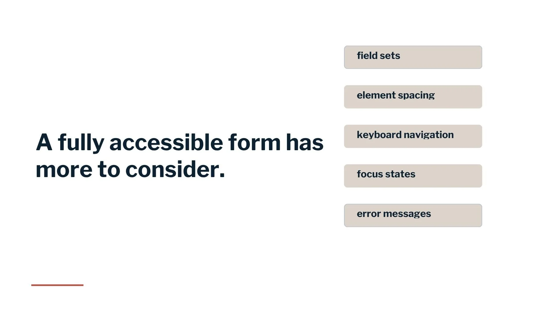
Accessibility Details Beyond the Basics
The basics matter, but they are not the whole picture. A fully accessible form also needs to account for how people move through it, understand errors, and interact with grouped questions.
For example
keyboard navigation matters because not everyone uses a mouse. A person should be able to move through the form, fill it out, select options, and submit it using only a keyboard.
Focus states matter too. A focus state is the visual indicator that shows which field or button is currently active. Without it, keyboard users may not know where they are on the page.
Error messages are another big piece. If someone misses a required field or enters information in the wrong format, the form should clearly explain what went wrong and how to fix it. A vague message like “Invalid entry” is not nearly as helpful as “Enter your email address in this format: name@example.com.”
Grouped content can also be important. When several options belong together, such as address information (street address, city, state, zip code), they should be structured in a way that makes the relationship clear.
These details are where many forms fall apart. A form may look fine on the surface but still be hard or impossible for some visitors to complete.
Wrap Up
Your website form is not just a few boxes on a page. It is one of the most important parts of your customer experience.
When your form is clear, accessible, and easy to use, people can take the next step with confidence. They can ask a question, book the appointment, request the quote, sign up, or complete the purchase without unnecessary barriers.
When your form is inaccessible, the opposite happens. People get stuck. They make errors. They get frustrated. They abandon the process. Most will never tell you there was a problem. They simply leave and choose another business.
That is why form accessibility is so important.
Need Help Reviewing Your Website Forms?
If you are not sure whether your forms are easy for everyone to use, we can help.
We review websites for accessibility and real users in mind, so you can find the barriers that may be costing you inquiries, signups, or sales. Whether you need a full accessibility review or help building a more inclusive website from the start, we will guide you through the process without the tech overwhelm.
Your forms should help people connect with your business, not stand in their way.

We helps small businesses build websites that are accessible, clear, and easier for EVERYONE to use from the start. If you want a professional review of your site’s accessibility, we’d love to take a look.
Website Form Accessibility FAQS
What makes a form accessible?
An accessible form is easy for people to understand, navigate, complete, and submit. It has clear labels, helpful instructions, visible fields, readable text, proper field types, keyboard access, clear focus states, and useful error messages.
Are form labels required for accessibility?
Yes, form controls need labels or instructions so users know what information is expected. Labels should always be visible. This helps all users, including people who use assistive technology.
Is placeholder text enough for a form label?
No. Placeholder text should not replace a visible label. It often disappears when someone starts typing and may be hard to read. Use placeholder text only as an optional example, not as the main instruction.
What is the difference between a label and field instructions?
A label names the field, such as “Email Address” or “Phone Number.” Field instructions provide extra help, such as “Use MM/DD/YYYY” or “Choose all that apply.” Labels tell people what information is needed. Instructions explain how to provide it correctly.
Why does form accessibility matter for business websites?
Forms are often how visitors become leads, clients, subscribers, or customers. If people cannot complete your form, you may lose inquiries, bookings, sales, and trust. Accessible forms remove barriers and make it easier for more people to work with you.