

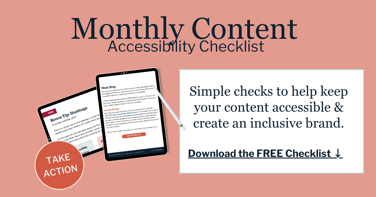
Give Your Website an Accessibility Spring Clean
Spring is when a lot of business owners start doing the cleanup that has been put off during busier seasons. They clear out storage rooms, reorganize supplies, toss outdated materials, freshen up their office, and get things back in order. It is a natural time to step back, look at what feels cluttered or outdated, and make things work better.
Your website deserves that same attention.
Usually, website spring cleaning means updating photos, rewriting old copy, removing outdated promotions, and checking that everything still reflects your business well. That is all worth doing. But there is another layer that matters just as much — making sure your site still works well for all your customers.
That is where accessibility comes in.
When accessibility guidelines talk about a better website experience, the big idea is simple — your website should be usable by more people, not just the people who browse the same way you do. In practice, that means your customers should be able to read your content, move through the page, understand your forms, and take action without running into any barriers.
A good spring cleanup is a great time to catch the kinds of issues that quietly build up over time. Not sure where to begin? Start with your top three high-traffic pages: usually your homepage, one of your main service pages, and your contact or booking page.
In This Article
Why start with your high-traffic pages first
Homepage accessibility spring cleaning checklist
Service page accessibility spring cleaning checklist
Contact page or booking page accessibility spring cleaning checklist
Why start with your high-traffic pages first
Your busiest pages are where people form their first impression of your business. They are also where small usability problems create the biggest friction.
If your homepage is hard to read, people may leave before they understand what you do. If your service page is hard to scan, visitors may not feel confident enough to move forward. If your contact page or form is frustrating, you can lose someone right when they are ready to buy.
This is also why accessibility is not separate from performance. A page is not truly doing its job if your customers are getting stuck or leaving it.
Homepage accessibility spring cleaning checklist
Your homepage needs to do three things well — explain who you are, make the page easy to move through, and point people toward the next step. Here are the five best things to review there first.
1. Clean up your heading structure
Heading structure is not just about formatting. It is about helping people understand what is on the page and how the information is organized. This means your homepage should have one clear main heading, then logical section headings underneath it. Visitors should be able to skim the page and quickly understand what each section is about.
A common problem is when headings are chosen because they look good visually, not because they clearly describe the section. A spring cleanup is the right time to make those headings more direct. “Website Accessibility Services” is more useful than something vague like “A Better Way Forward.”

2. Improve text contrast
A spring refresh might mean new colors, softer palettes, or lighter text overlays on photos. That is exactly where readability problems creep in. WCAG’s contrast guidance exists so text can still be read by people with low vision, color vision differences, or age-related vision loss. For standard-size text (under 18pt) you’re aiming for a contrast ratio of 4.5:1.
*NOTE*
The important reminder here is that homepage color changes often do not stay on the homepage. On many websites, especially theme-based builds, changing brand colors, button colors, or text colors in one place can affect headings, buttons, links, forms, and other elements across the entire site. So if you adjust colors on the homepage, double check your other pages. A change that looks clean in one section can create contrast issues somewhere else.
If you need a tool to verify your contrast ratios try this FREE Color Contrast Analyser for Windows or Mac.
3. Make buttons and links clearer
Clear labels matter. People should be able to tell what something is and where it will take them if they click on it. That means all your buttons and links should clearly say where someone will go or what they will get if they click on it.
“View Our Services” is clearer than “Learn More.” “Book a Consultation” is clearer than “Get Started.” This is a small cleanup item, but it makes a real difference when someone is moving quickly through the page.

4. Test your homepage with just your keyboard
This is one of the most useful checks you can do yourself.
Keyboard accessibility guidelines say that when someone moves through a page using the Tab key, there should be a visible focus indicator. This means you should always be able to see where you are on the page as you tab from one item to the next. That visible outline, highlight, underline, or border around the active link, button, or field is the focus indicator. It is the marker that shows, “you are here.” Without it, people who use a keyboard instead of a mouse can easily get lost.
A simple keyboard test looks like this
Open the page
Put your mouse aside, and start pressing the Tab key
Watch where the focus moves. You should be able to move through the navigation, buttons, links, and form fields in a logical order. Each time you tab, you should clearly see the focus indicator. If the indicator disappears, gets hidden, skips important items, or lands somewhere unexpected, that means you have a problem that needs to be fixed.
This is especially important on homepages with popups, sliders, announcement bars, dropdowns, or custom buttons. Those are often the places where keyboard issues show up first.
5. Review your image alt text
Homepage images should either support the message or stay out of the way. Informative images need useful text alternatives. Decorative images should not create noise for screen readers. This is one of the easiest places for clutter to build up over time, especially when sites get refreshed seasonally.
The WCAG guidelines for Images comes down to a simple question: is this image adding useful information, or is it just there to fill space?
If an image is there to communicate something important, it needs to have appropriate alternative text. If it is purely decorative, it should be marked as such so screen readers skip over it.

Every image on your website has a job.
Learn the three main types of images found on every website and how to handle alt text for each kind.

Alt Text & Image Descriptions
Improve your websites accessibility by becoming an expert at writing good alt text.
Service page accessibility spring cleaning checklist
Your service page is where people decide whether you are the right fit. If that page is hard to follow, too vague, or visually confusing, you are creating uncertainty right where you need to build confidence.
Check these five areas on your service page to improve user experience.
1. Break up long sections with clear headings
This comes back to helping people understand what is on the page and how it is organized. On a service page, that usually means breaking the content into sections people are already looking for — what the service is, who it is for, what is included, what the process looks like, and how to get started.
This helps people who use assistive technology, but it also helps your average busy visitor. Most people are not reading every line. They are scanning to decide whether they are in the right place.
2. Do not use color alone to explain something
Service pages sometimes use color to signal meaning without realizing it. Maybe green text is used to show a sale or limited-time offer. Maybe red text is used for a disclaimer, restriction, or important note. Maybe certain package features are marked in one color to show what is included, while another color is used to show upgrades or exclusions.
The problem is that color should not be the only clue.
If someone cannot easily distinguish those colors, they may miss the meaning entirely. A visitor should still be able to understand the message even if the color difference is not clear. So, if you are using green to highlight a special offer, say that plainly in the text (i.e. Special Offer 30% Off). If you are using red for a disclaimer or important warning, label it clearly as an important note or restriction.
A good rule of thumb is to ask: if I removed the color from this section, would the message still make sense? If the answer is no, that section needs more support.
3. Add captions to videos and review embedded media
If your service page includes a welcome video, process video, or testimonial video, spring cleaning is a good time to make sure it is fully accessible.
The rules here are simple. If a video includes speech or audio, there must be captions (and/or a transcript) so those who cannot hear or choose to watch the video without sound still have access to the information in the video.
If you don’t see the “CC” (closed caption) icon in your videos tool bar, you have some work to do. And to provide the best experience for your users interacting with your video or audio content, link a copy of the transcript just before or after the video.
4. Make cards and icons easier to understand
A lot of service pages use visuals to break up information, which can be helpful when they are done clearly. You might have a row of icons showing what is included in your service, like strategy, design, content updates, and ongoing support. You might use feature cards to highlight different services, packages, or next steps.
Those kinds of sections can work well, but only if their purpose is obvious.
An icon by itself is not always enough to explain something. For example, a checkmark icon, a clock icon, or a gear icon may make sense visually to some people, but not everyone will interpret them the same way. The text around that icon needs to do the real work of explaining what it means. While the icon itself is likely a decorative image and should be marked as such.
This is another place where a spring cleanup can help. Look at any icon section, service card row, or linked content block on the page and ask a few simple questions. Is it clear what this section is about? Is it obvious where each link goes? Would the meaning still make sense if someone were skimming quickly? If the answer is no, the section likely needs clearer labels, stronger headings, or more descriptive link text.
5. Review how your pricing is presented
Spring cleanup is often when businesses update pricing, package details, or what is included in a service. That is a good time to check not just whether the pricing is current, but how it is being shared on the page.
Your pricing information should be built into the page using real text, headings, lists, and buttons people can actually read and navigate. It should not rely on a graphic with pricing baked into the image, or a PDF someone has to open just to understand your services.
That matters because pricing is important content, not decoration. If your prices, package names, or included features are locked inside an image or hard-to-use PDF, some customers may have a much harder time accessing that information. It is also harder to scan, harder to update, and often less user-friendly on mobile.
A better approach is to keep pricing details in text blocks right on the page. That way the information is easier to read, easier to navigate, and easier to maintain when things change. If you do offer a downloadable PDF, it should support the page content, not replace it.
Contact page or booking page accessibility spring cleaning checklist
Your contact page is the one closest to conversion, which means accessibility issues here cost more than convenience. They can cost actual customers.
Our focus here is on making sure your form works properly for keyboard and screen reader users.
1. Make sure each field has a visible label
Every form field needs a label, so people know what information to enter. This label should be clear and placed above the field where the user will type their answer.
Your job here is to see if your form has labels or placeholder text. Placeholder text is the faint text inside the box people type into, like “Enter your email” inside the field itself. Labels are the words outside the box, like “Email Address” above or next to the field.
Understanding that difference is super important
Placeholder text lives inside the typing area and usually disappears once someone starts typing. A proper label stays visible. So during a spring cleanup, this is one of the first things to check on any contact form. If the directions vanish as soon as someone clicks into the field, you are using placeholder text and not a proper label, which is making your form difficult and maybe impossible for some users to complete.
2. Make sure your instructions aren’t disappearing
People should not have to guess what a field means, whether it is required, or what format you want. If you need a phone number in a certain format, say so. If a field is required, make that clear. If the user needs to include specific details, tell them before they type.
If you are using placeholder text to give instructions, your directions will disappear once someone starts filling out the form. Those instructions need to be moved outside the field where it stays visible.
3. Keyboard test the full form
Can someone tab through each field in a logical order, select options, submit the form, and clearly see where focus is at every step?
This is a crucial WCAG guideline and where a lot of websites fail an accessibility audit.
To test your form, you’ll tab through it similar to what you did for your homepage cleanup.
Start at the top of the contact page and press Tab to move through the form. Watch whether the focus indicator appears on every field, checkbox, dropdown, and submit button. If you cannot see where you are, that is a problem to address
Pay attention to the tab order. Does it move in a sensible sequence? Does it skip fields? Does it get trapped in a popup, calendar, or embedded widget?
Fill out the form. Once you’ve tabbed to the first field, fill it out and tab to the next. Use the enter or space bar to select a checkbox or radio button and arrow keys to navigate a dropdown menu.
See if you can submit the form without touching the mouse?
If you run into any issues these are critical problems to fix right away.
4. Review your error messages
If a user makes a mistake or misses a field when filling out your form they need to know what to do. Good error messages should tell the user exactly what needs attention and help them fix it quickly. “There was an error” is not enough. People should be able to tell which field needs attention and what to do next.
Being able to fix or adjust error messages fully depends on what platform you are using.
On Squarespace, the built-in form tools can be fine for basic setups, but they are more limited. You can control the fields, button text, layout, and some of the messaging, but you may not have as much flexibility over how validation and error handling work.
On WordPress, you usually have more control because the platform allows more customization through plugins and custom development. That often makes it easier to improve error messages, validation behavior, and the overall form experience.
This can be a difficult thing to fix, so for now just test your form to see how errors are handled.
Fill out your form intentionally making mistakes (leave a required field blank, use the wrong format for email or date), and click submit.
What error notification appears? Is there clear information on what was wrong and how to fix it? Are the error fields visually marked and have written explanations of what to do?
These are only a few of the error issues that can occur. So, if your form isn’t clearly helping people correct a mistake and complete your form, you are losing customers and it is imperative to contact a professional to fix it right away.
5. Simplify the form and page
A lot of contact pages get overloaded over time. Extra fields, embedded maps, popups, chat tools, and multiple competing calls to action can make the page harder to use.
Now is a good time to ask a simple question — does this contact page make it easier or harder for someone to reach you?
Make sure your form is concise. The longer the form, the less likely people are to fill it out, especially if this is their first time connecting with you.
People should have one option on the contact page, fill out a form or make an appointment. Don’t give them the option to go back to other pages. Remove links and other distractions.
What to do if you find problems you cannot fix yourself
Doing your own website spring cleanup is a smart place to start. But if you get into it and realize you are not sure how to fix a form issue, a keyboard navigation problem, disappearing focus states, confusing error messages, or color changes that created new readability problems, that is exactly where we can help.
Accessibility issues are not always obvious, and they are not always easy to fix inside a template or page builder. Some are content problems. Some are design problems. Some are platform limitations. Some need help behind the scenes. The important thing is not guessing and potentially creating more problems.
At Access Designs LLC, we help small businesses fix the accessibility issues that are easy to miss and frustrating to solve on your own. So if your spring cleanup uncovers problems you do not know how to fix, let’s take a look together and help your site work better for all your customers.
Website Cleanup FAQS
What are the easiest accessibility fixes to start with on a website?
Start with heading structure, color contrast, link text, and form labels. These changes are practical, visible, and tied directly to how people move through your site. They also show up again and again in WCAG guidance and accessibility checklists.
Which pages should I fix first for website accessibility?
Start with your highest-traffic and highest-impact pages. For most small business websites, that means the homepage, a main service page, and the contact or booking page. These are the pages most likely to shape trust and lead generation.
Are accessibility widgets enough to fix my website?
No. They are not a replacement for built-in accessibility. Real improvements come from the way your site is structured, written, designed, and coded. Access Designs LLC does not recommend widgets or overlays as the solution.
Is WordPress better than Squarespace for accessible forms?
Not automatically, but WordPress usually gives you more control. Squarespace forms are easier to set up quickly, but they are more limited. WordPress often allows deeper customization of validation, error handling, and form behavior, depending on how the site is built.
How often should I review my website for accessibility?
This really depends on how often you are adding/changing the content on your website. A quarterly review is a great place to start, especially after adding new pages, forms, videos, blog posts, or design changes.

We helps small businesses build websites that are accessible, clear, and easier for EVERYONE to use from the start. If you want a professional review of your site’s accessibility, we’d love to take a look.